









Most instructors meet video analytics in a slightly awkward context. Someone from IT or the teaching centre shares a dashboard, there are a lot of numbers on it, and the implied question is "are students watching?"
It is a fair question, but it is not a very interesting one. It also sets the wrong tone, because it turns a rich source of insight into something that feels like a monitoring exercise.
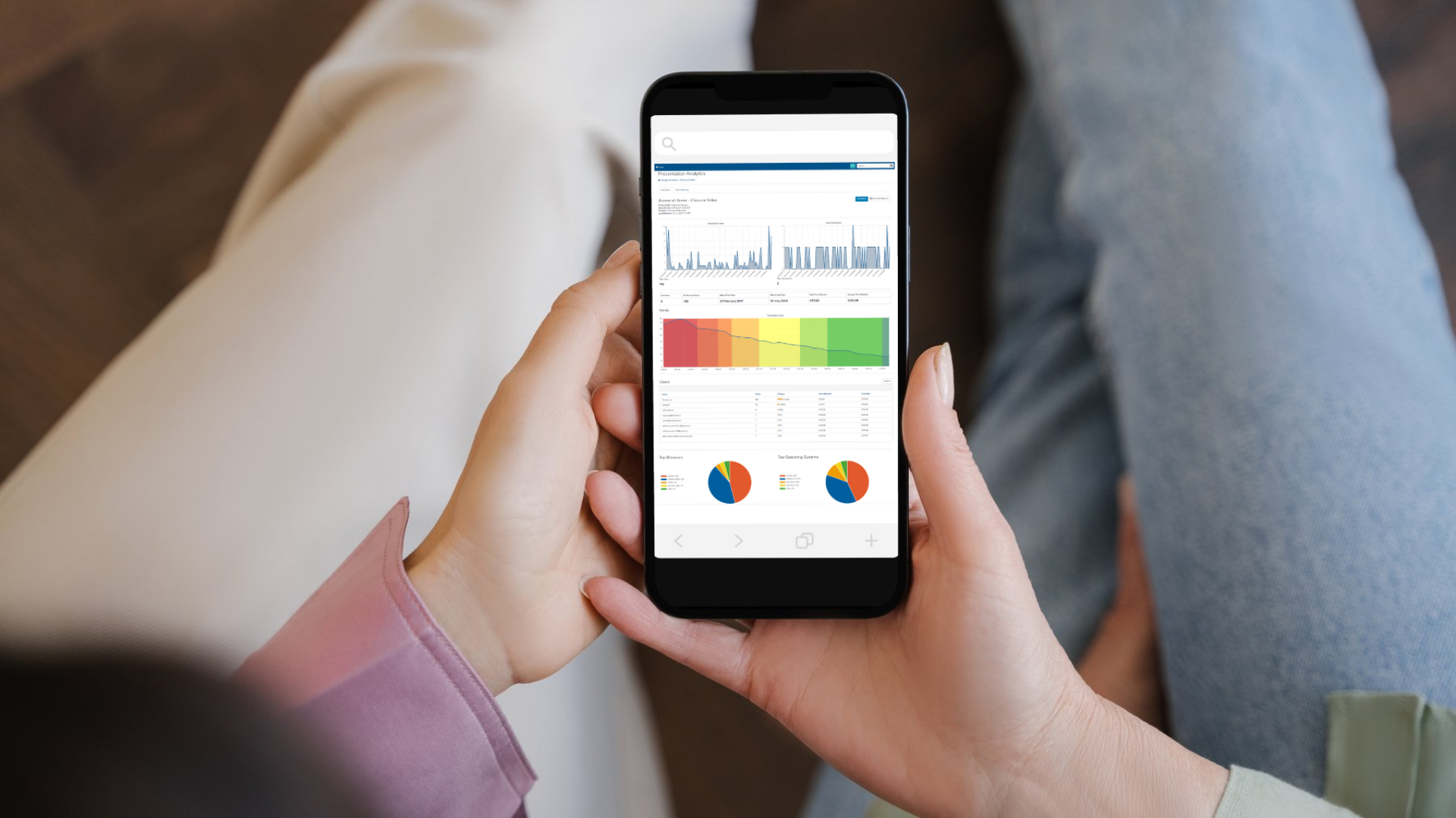
There is a more useful way in. Your recordings are not just being watched, they are being used. Students return to them the night before an assessment, work through a demonstration a second time before attempting it themselves, and dip into a session weeks after it happened because something in a later topic sent them back. Viewing data is a record of that studying, and it is one of the few windows you get into what happens after students leave the room.
Read that way, it stops being a tracking exercise and becomes something closer to a conversation.
Start with a question, not a dashboard
The fastest way to get nothing out of analytics is to open the reporting view and browse. There is always something to look at, and almost none of it means much on its own.
Bring a question you already have instead. Most instructors are carrying two or three of these at any point in a term:
- Are students using the pre-seminar material before the session, or afterwards?
- Did anyone go back to the recording I made for the trickier topic in week five?
- Is the extra material I produced last year still being utilised?
Viewing data answers questions like these well. It answers "how is the module going?" very poorly. Start narrow and the numbers become readable.
What Mediasite actually shows you
It helps to know the shape of the data before interpreting it, and how you get to it in the first place.
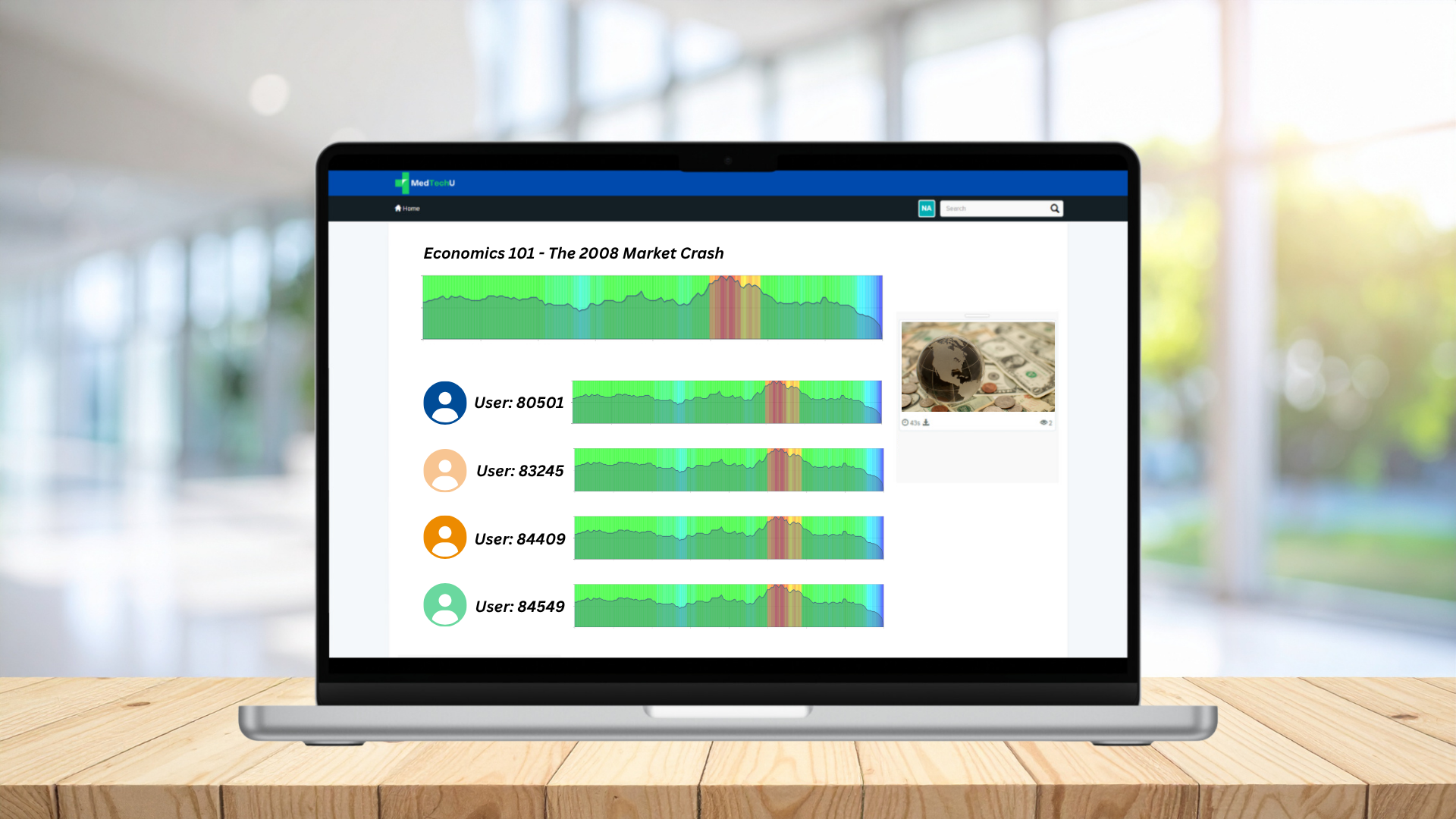
Mediasite reporting is configurable, which matters more than it sounds. Rather than handing you everything at once, a report can be scoped to exactly what you are responsible for. An instructor teaching Economics 101 can have a User Statistics Report set up that covers their course folder and channel, limited to the fifty students in that year group. Everything they see is then relevant to them, and nothing else is.
Within that report, the top level shows the class as a whole in graphs and heatmaps. You can then click into an individual student if you need to. Most of the time you will not, and there are good reasons to stay at the aggregate level, which is covered further down.
If you have never seen a report like this for your own module, that is the first thing to ask your Mediasite administrator or teaching centre for. It is a one-off setup, and it makes everything below considerably easier.
For the content in scope, the report covers:
Views. How many times the content has been opened.
Time. Total time watched, shown as hours, minutes and seconds.
Coverage. The percentage of the video watched. At the top level of a report this reflects your viewers collectively, and you can drill into a single student to see theirs.
Range. The date it was first watched and the date it was last watched.
Viewing trends. A heatmap showing which parts of the video have been watched most.
Date activity. A graph showing which dates saw the most viewing.
Platforms. The devices and browsers used to watch, such as Mac, Windows, or Chrome.
Seven simple measures. The value is almost entirely in how you read them together.
Viewing trends: where students are putting the effort in
The heatmap is the most interesting of the set, and the easiest to misread.
When a stretch of a recording shows noticeably heavier viewing than the rest, the instinct is to treat it as a problem, that students are not engaging with the full material. In practice it is usually a sign that students have correctly identified the part that matters most and are investing time accordingly. That is what you want them doing.
The useful follow-up question are not "what did I get wrong there?" or "Why did they skip those sections of the video?" but something simpler like: "is that section easy to work with?"
Sometimes it clearly is, and the heavy viewing simply reflects a demanding idea that needs more than one pass. Some concepts are like that, and repetition is exactly the right response to them.
Sometimes it points at something practical instead. Material that is dense on screen, a diagram that is referenced before it appears, or a stretch where you covered a lot of ground quickly because time was short. None of these are teaching failures. They are the ordinary compromises of live delivery, and video is one of the few things that lets you notice them at all.
Where a section is doing a lot of work for students, a short supplementary recording of two or three minutes is often the best possible use of your time. It costs very little and it targets exactly the material students have already told you they care about. It's also a great time to use Mediasite Capture to be able to quickly record videos in your browser or mobile phone for these quick overview videos.
One practical note: look for patterns that repeat across cohorts. A heatmap from a single term can be shaped by a handful of students. The same shape appearing two years running is telling you something more solid.
Coverage and range: how students really study
Coverage and range are quiet metrics that reward a bit of attention.
Low coverage across a group is not automatically a problem. Students frequently arrive at a recording looking for one specific thing, find it, and leave. That is efficient behaviour and a sign that your content is navigable, particularly for longer sessions. Coverage becomes more interesting when you expected a recording to be watched end to end, such as a short primer, and it consistently is not.
Because coverage reads differently depending on where you are in the report, it is worth being clear with yourself about which question you are asking. The class-level figure tells you how a piece of content is being used overall. An individual figure tells you about one student's study pattern, which is a different question with different implications, and one that usually belongs in a conversation with them rather than a spreadsheet.
Range is more revealing than it first looks. A wide gap between the first and last viewing date tells you a piece of content has a long life. It was watched when it was released, and again much later, usually during revision or when a related topic brought students back. Content with a long range is your most reusable material, and it is worth knowing which recordings fall into that category before you decide what to update over the summer.
Date activity: the rhythm of your module
The date activity graph shows when viewing happens, and the pattern usually maps neatly onto the pressure points of your module.
Clusters ahead of assessments are entirely expected. What is worth noticing is where those clusters sit relative to your intentions. If material designed to prepare students for a seminar is mostly being watched the evening after it, that is useful to know, and it is usually a scheduling or signposting matter rather than a motivation one. Releasing it earlier, or referencing it more explicitly in the week's communication, often shifts the pattern on its own.
Platforms: a small metric with practical consequences
Platform data rarely gets a second glance, but it has one very practical use. If a meaningful share of viewing is happening on smaller screens, that has implications for how you build slides.
Detailed tables, small annotations, and dense diagrams all behave very differently on a phone than on a projector. Knowing where your content is being watched is a cheap way to make it easier to use, and it benefits every student rather than only a few.
What the data will not tell you
Being honest about the limits is what makes the rest of this credible.
Viewing data can tell you that someone was present for a section. It cannot tell you whether they understood it. It will not capture the student who watched alongside a friend on one screen, or who read the transcript instead of watching, or who paused because the doorbell went.
Because you can drill down to an individual student, it is worth being deliberate about when you do. The class-level view answers almost every question you are likely to have about your content, and it is where you should spend most of your time. Individual data has a legitimate place, usually when you are already supporting a specific student and they know why you are looking, but it is not a general-purpose tool.
Framing all of this as content improvement rather than attendance monitoring is both more accurate and much better for the trust you rely on in the room. Your institution will have guidance on the use of student data, and it is worth reading it before you start rather than after.
Treat it as one input among several, sitting alongside the questions you get after class, what surfaces in office hours, and how assessments turn out.
Make it a habit, not a project
The instructors who get most from this do not carry out a deep analysis once a year. They spend fifteen minutes on it twice a term.
A workable rhythm looks like this. Before the term starts, ask for a report scoped to your course folder and your cohort, so the data is waiting for you rather than something you have to go and assemble. Around week four, open the viewing trends for the two or three recordings covering material students traditionally find demanding, and simply notice where the attention is going. Around week nine, glance at coverage and date activity across the module. At the end of term, write down the two changes worth making next time while the context is still fresh.
That is under an hour across a semester, and it compounds. Each pass makes your content a little easier for students to work with, which is a far more achievable goal than improving everything at once.
The recordings are already being made. The data is already there. It costs very little to start listening to it. Getting started with Mediasite Analytics has never been easier. If you have any questions about the possibilities, don't hesitate to reach out to our Solutions Engineers or via our Mediasite Community.
 English
  Français
  日本語
日本語  Español
  Italiano
  Nederlands
  Deutsch